The Long Road and the Forest - Chapter 1 & 2
Devlog Update 4 (Ben) - Drawing trees (and why I am not very good at it)
One of my biggest fears around using a forest and a pixel art style was the amount of effort that crafting a tree would take - tree leaves, branches and shapes are incredibly complex, and difficult to represent without feeling flat.
I was keen to avoid representations like this, which I've seen in a variety of pixel art games:
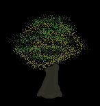
Whilst I think this is an effective technique, I think it tends to start looking muddy, and "cotton candy like" when placed next to other trees - and I'll probably be drawing a LOT of trees in this game. I tried a lot of different things and always ended up feeling really disappointed with the results, which always looked a bit like this:
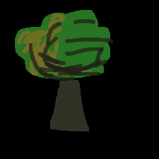
Great bloody job. It was hard to really depict the moody, dark aspect of the forest in the game, with a very limited size canvas (640x360) and trying to not draw every single leaf. I was able to produce some high quality images if i focused for hours on the tree - at the expense of finishing the scene.
So focusing on my usual objectives of quality but not at the expense of speed, I went looking for inspiration for my "pixel-art-but-not-really" style. I was very fortunate to visit the Van Gogh museum, and saw his paintings and was really inspired by the way that he and other impressionist painters were able to capture natural forms like trees with unusual brush strokes, but still make what they were drawing look "tree-like".
#/media/File:Van_Gogh_-_B%C3%A4ume_und_Unterholz.jpeg)
Despite his sparing brush strokes, he was able to really capture what dense forest looked like - obviously I will never be as good as Van Gogh (or really many people at all!), but I saw a good ethos there - more expression, less focus on detail.
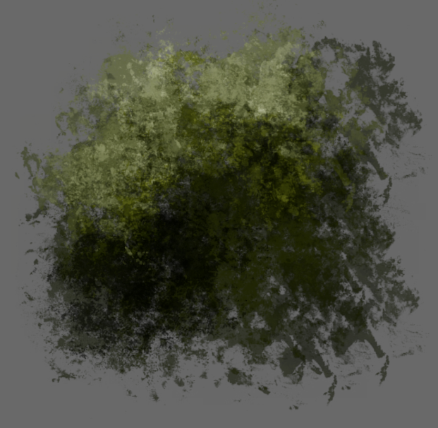
So I tried some different approaches where I used single brush strokes to convey the general shape of a tree:
Then selectively add patches of light and shade where I thought the light would strike:
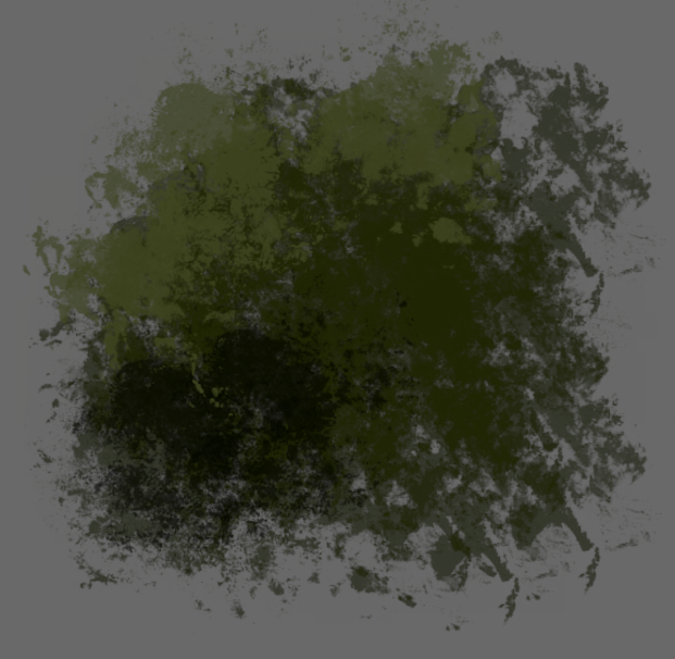
Then accentuate the light effect with the burn tool:
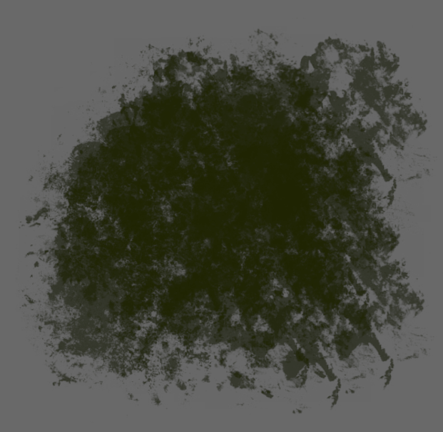
When applied to the scene - it'd look something like this:
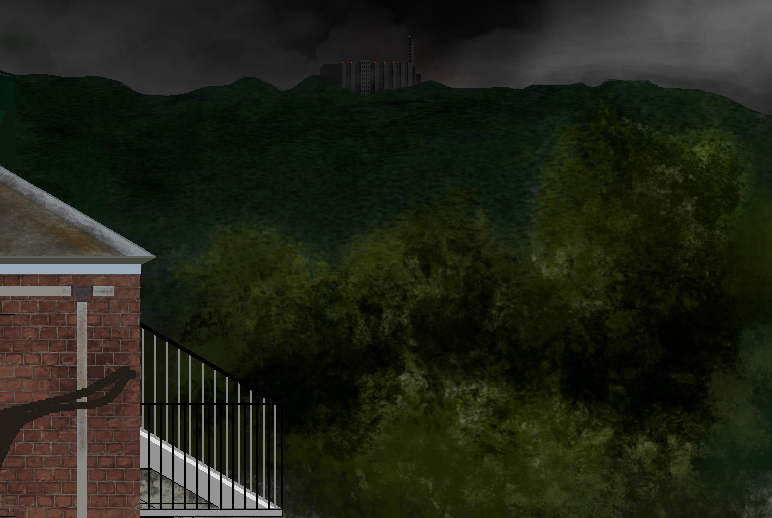
What I hope the effect achieves is a creepy, impressionist effect that allows me to spend less time obsessing over detail, and still give the grimy, dark quality to the world Mariska finds herself in. I wanted to give a "crowded" effect - where many trees blend and compete in the visual space, without feeling like it was pixels colliding, but still give a sense of light, depth and otherworldliness. Pretty lofty goals and I still worry a great deal that this really works correctly, but I am trying to be more confident with expression and less focused on accurate depiction.
Leave a comment
Log in with itch.io to leave a comment.